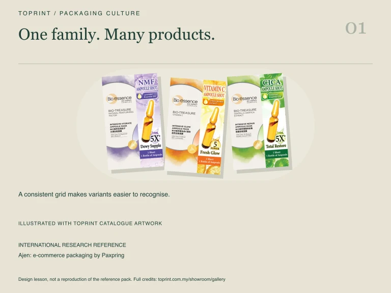
| 1 | Ajen: e-commerce packaging by Paxpring ↗ | 99/100 | Modular trays organise a coordinated product family |
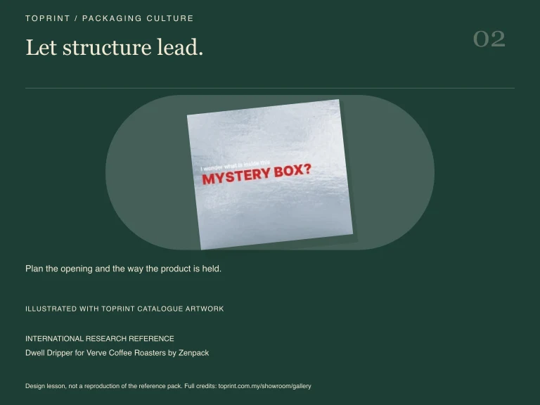
| 2 | Dwell Dripper for Verve Coffee Roasters by Zenpack ↗ | 99/100 | A folded carrier displays and carries the product |
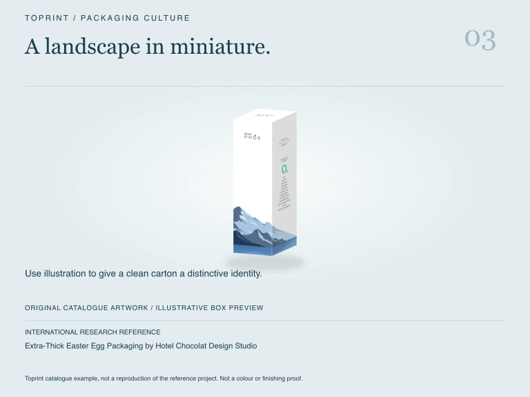
| 3 | Extra-Thick Easter Egg Packaging by Hotel Chocolat Design Studio ↗ | 99/100 | Ribbed paper forms make a gift feel sculptural |
| 4 | LEGO® Pick a Brick by The LEGO Group ↗ | 99/100 | Folded paper boxes offer a clear opening sequence |
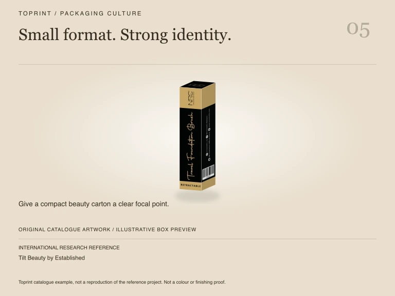
| 5 | Tilt Beauty by Established ↗ | 99/100 | Large ergonomic forms make use part of the design |
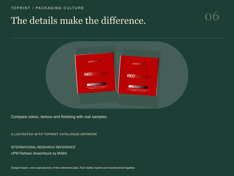
| 6 | UPM Raflatac Swatchbook by MABA ↗ | 98/100 | Layered cutouts turn material samples into discovery |
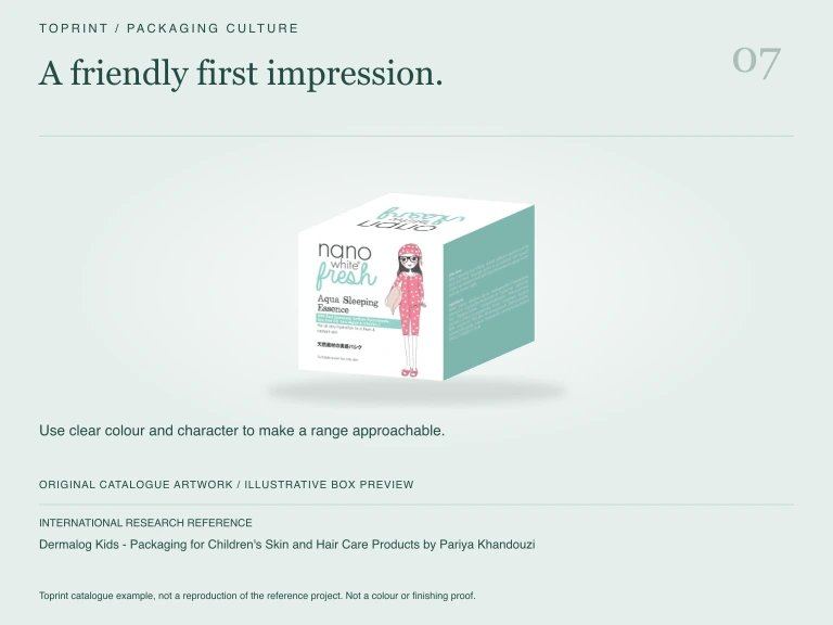
| 7 | Dermalog Kids - Packaging for Children's Skin and Hair Care Products by Pariya Khandouzi ↗ | 97/100 | Character silhouettes make cartons friendly and readable |
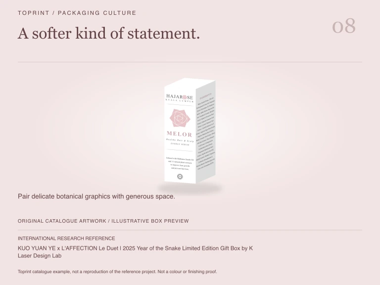
| 8 | KUO YUAN YE x L'AFFECTION Le Duet | 2025 Year of the Snake Limited Edition Gift Box by K Laser Design Lab ↗ | 96/100 | A bold graphic sleeve introduces an organised gift tray |
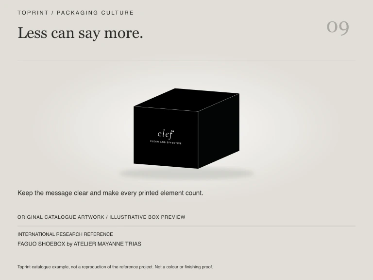
| 9 | FAGUO SHOEBOX by ATELIER MAYANNE TRIAS ↗ | 96/100 | Minimal kraft packaging connects box and product story |
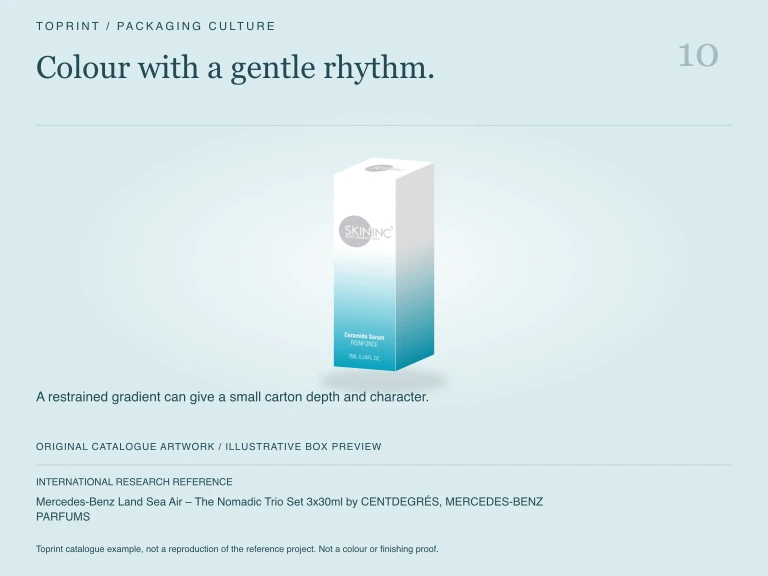
| 10 | Mercedes-Benz Land Sea Air – The Nomadic Trio Set 3x30ml by CENTDEGRÉS, MERCEDES-BENZ PARFUMS ↗ | 96/100 | A compact three-piece kit communicates a complete ritual |
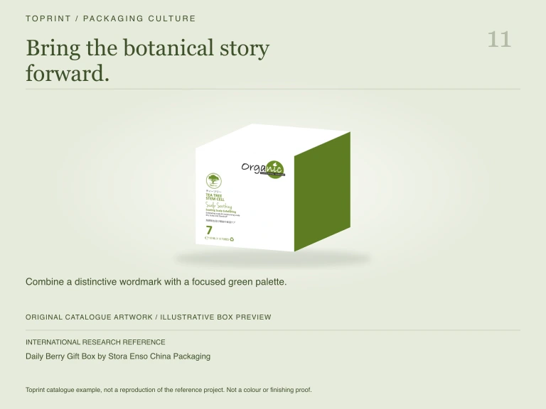
| 11 | Daily Berry Gift Box by Stora Enso China Packaging ↗ | 95/100 | Bright handled cartons make fresh-food gifts joyful |
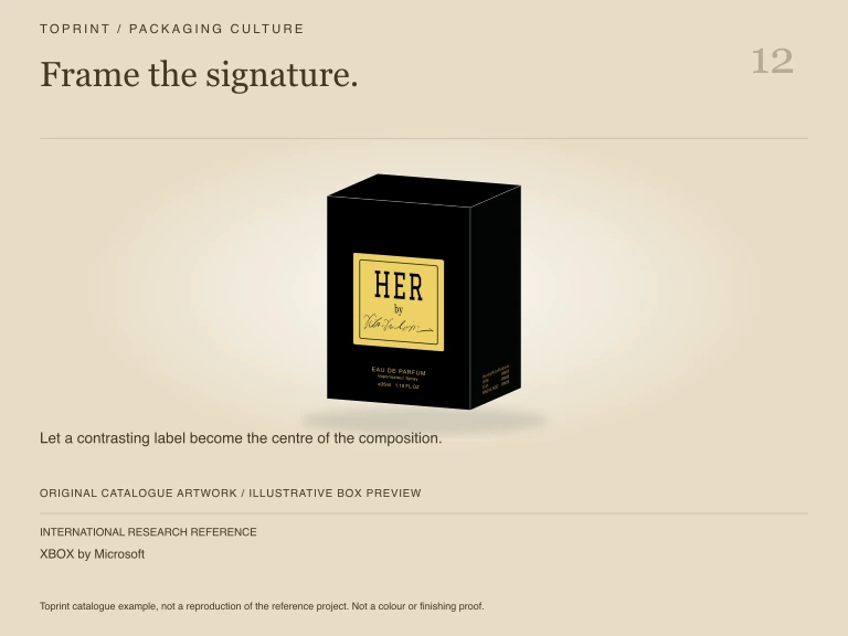
| 12 | XBOX by Microsoft ↗ | 95/100 | A layered reveal supports a purposeful opening sequence |
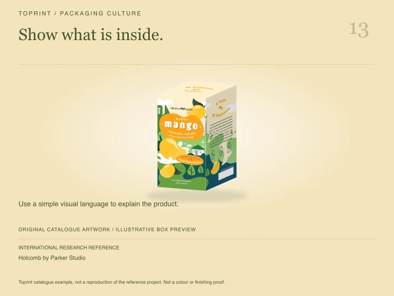
| 13 | Holcomb by Parker Studio ↗ | 94/100 | An outlined vessel makes quiet cartons communicate contents |
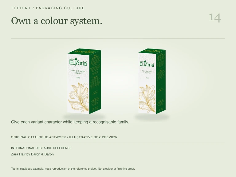
| 14 | Zara Hair by Baron & Baron ↗ | 94/100 | Distinctive colours unify a beauty-product collection |
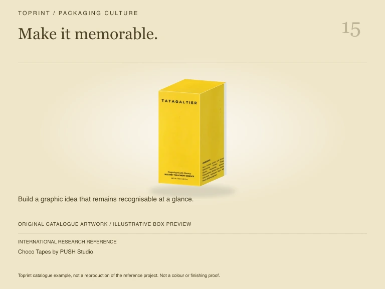
| 15 | Choco Tapes by PUSH Studio ↗ | 93/100 | A cassette-inspired gift set adds playful discovery |
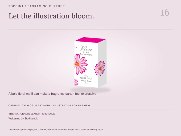
| 16 | Wakening by Studioenok ↗ | 92/100 | Large continuous symbols connect cartons as a system |
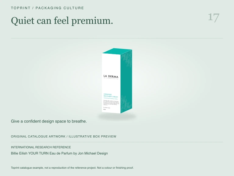
| 17 | Billie Eilish YOUR TURN Eau de Parfum by Jon Michael Design ↗ | 92/100 | Embossed restraint makes the fragrance feel sculptural |
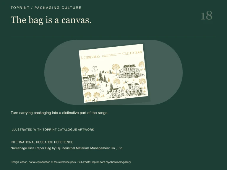
| 18 | Namahage Rice Paper Bag by Oji Industrial Materials Management Co., Ltd. ↗ | 92/100 | Handled paper bags combine utility and illustration |
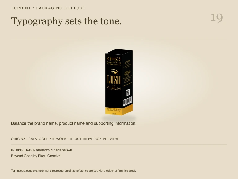
| 19 | Beyond Good by Flock Creative ↗ | 91/100 | Oversized type turns the carton into a poster |
| 20 | 365 - 2025 — Un anno epico by onlab ↗ | 89/100 | Foil circles create a strong visual rhythm |
| 21 | Daisyface Skincare by BLOND ↗ | 89/100 | Repeated fluted profiles create a cohesive beauty family |
| 22 | Meta Quest 3S by Meta Design ↗ | 88/100 | Product silhouette makes an unboxing promise |
| 23 | The LEGO Group x F1® ready to race by The LEGO Group ↗ | 88/100 | A reveal-style presentation turns opening into theatre |
| 24 | L’ENTROPISTE – MASTER OF DISORDER by CENTDEGRES ↗ | 87/100 | Offset vertical typography complements sculptural forms |
| 25 | Roam SodaTop™ by Roam ↗ | 87/100 | A visible bottle window connects carton and contents |
| 26 | WOOGIE by Shanghai Version Design Group ↗ | 87/100 | Stacked board layers make materials visible |
| 27 | PUEBLO by SIMPLE PACKAGING STUDIO ↗ | 86/100 | A paper bag becomes a simple hanging display |
| 28 | Wink Eyewear by Studio Kluif ↗ | 86/100 | A custom cutout lets the product become the graphic |
| 29 | Echo Flask by Echo ↗ | 85/100 | A restrained book-style kit frames its contents |
| 30 | SEKKISEI BLUE Skincare series by KOSÉ Corporation ↗ | 85/100 | Quiet botanical colours support a consistent care range |
| 31 | Arla Stripes by IW ↗ | 84/100 | Large stripes make variants instantly recognisable |
| 32 | BOTITO by Tridimage ↗ | 84/100 | Character-led form makes the pack a keepsake |
| 33 | LISA ELDRIDGE REFILLABLE LIPSTICK by Servaire& Co ↗ | 84/100 | Fine vertical ribs make touch part of the experience |
| 34 | TCM Packaging by +1 Design & China Resources Sanjiu Medical & Pharmaceutical Co., Ltd. ↗ | 84/100 | Vertical text and faceted cartons emphasise structure |
| 35 | Domino's by Jones Knowles Richie ↗ | 84/100 | A brand mark becomes the entire box graphic |
| 36 | Starck Paris by Perfumes y Diseño ↗ | 84/100 | A framed trio creates a deliberate gift presentation |
| 37 | Gelée by RoAndCo Studio ↗ | 83/100 | A central organic shape unifies many carton sizes |
| 38 | Hennessy Paradis by NR2154 ↗ | 83/100 | An organic protective shell feels like an object |
| 39 | Lazy Tan by Derek&Eric ↗ | 83/100 | One yellow colour gives cartons strong shelf presence |
| 40 | Machetto - Pestato di Alici by IDEA STUDIO ↗ | 83/100 | A shaped sleeve frames a familiar container |
| 41 | mezete by Bombay Design Centre Private Limited ↗ | 83/100 | Warm circles organise a colourful food range |
| 42 | Naveia Culinary Line by HardCuore ↗ | 83/100 | Friendly line drawings make kitchen packaging approachable |
| 43 | totte by Adjuvant cosme japan ↗ | 83/100 | Natural paper and pastel vessels create a calm contrast |
| 44 | Vantastic by Backbone branding ↗ | 83/100 | Warm backgrounds unify a diverse food family |
| 45 | DIPTYQUE LES ESSENCES by Servaire & Co ↗ | 82/100 | Rounded black caps unify sculptural fragrance bottles |
| 46 | Grow Up by Simply ↗ | 82/100 | Clear windows pair product visibility with playful characters |
| 47 | Hatice Schmidt by Established ↗ | 82/100 | A linked metallic silhouette suggests jewellery |
| 48 | Moët & Chandon Collection Impériale by NR2154 ↗ | 82/100 | A sculptural pale surround emphasises the bottle |
| 49 | NARS Explicit lipstick by Baron & Baron ↗ | 82/100 | Embossed black branding creates a tactile silhouette |
| 50 | Salash by Onfire Design ↗ | 82/100 | A blue pattern frames the food as the hero |
| 51 | Marc Jacobs Beauty Line by Established ↗ | 82/100 | A capsule-shaped family uses material consistency |
| 52 | OGT (ONE GOOD THING) by This Way Up ↗ | 82/100 | Friendly type and product visibility communicate quickly |
| 53 | bi tian Brand rice packaging by Hangzhou dongyun advertising design co.,ltd. ↗ | 81/100 | A quiet white carton foregrounds a vivid emblem |
| 54 | Dark Arts Coffee Packaging by NOT Wieden+Kennedy ↗ | 81/100 | Tiny illustrated labels contrast with dark cartons |
| 55 | Fishsnax by Studeau Design ↗ | 81/100 | Vintage typography gives a simple sleeve character |
| 56 | La Vie - From Plants with Love Everland ↗ | 81/100 | Illustration and type make an energetic family system |
| 57 | Wanderlands by SLATE ↗ | 81/100 | An atmospheric landscape adds ingredient context |
| 58 | Johnnie Walker Blue Label Ice Chalet by Bulletproof ↗ | 80/100 | A soft cover adds a premium tactile layer |
| 59 | SOTAVENTO AOVE by Javier Garduño Estudio de Diseño ↗ | 80/100 | A raised folded label gives depth to a flat surface |
| 60 | Mutti spa by Auge Design ↗ | 80/100 | A repeat pattern builds recognisable shelf impact |
| 61 | CASA MARRAZZO 1934 by Auge Design ↗ | 80/100 | Abstract colour blocks make a strong retail family |
| 62 | Beet Vishandel by Studio Kluif ↗ | 79/100 | Unexpected food-style trays create category surprise |
| 63 | Carrefour Home by Carrefour ↗ | 79/100 | Consistent product photography unites a broad range |
| 64 | El encantador de Pájaros by IRÜBI estudio creativo ↗ | 79/100 | Hanging bird-house cartons add a display narrative |
| 65 | Marlenka by Kantors Creative Club ↗ | 79/100 | Appetising product photography supports clear variant labels |
| 66 | NATURE CLEAN: Sustainable cleaning and washing products by ARD Design Agency ↗ | 79/100 | A cool colour system unites everyday care products |
| 67 | The beauty of nature—Lotus root wine by Wuhan PUFINE Creative Technology Co., Ltd ↗ | 79/100 | An organic bottle silhouette echoes a botanical idea |
| 68 | Eminente Reserva by Moët Hennessy ↗ | 79/100 | Repeated textured glass gives a distinctive family identity |
| 69 | BOTA DE VINO / WINESKIN by Vamos Estudio ↗ | 78/100 | One diagonal label gives a carton strong tension |
| 70 | Brewmaster Reserve by Shenzhen Tigerpan Design Co., Ltd. ↗ | 78/100 | Sculptural wrapping celebrates a ceremonial opening |
| 71 | Cooper Coffee Roasters by maan - identity. design. content. ↗ | 78/100 | A bold cutout-like mark anchors a flexible pouch |
| 72 | DKNY 24/7 by Jon Michael Design ↗ | 78/100 | Reflective rounded forms create a distinctive silhouette |
| 73 | Holy Aioli by Onfire Design ↗ | 78/100 | A friendly badge makes the label approachable |
| 74 | Yiayia and friends Harvest of Love by BEETROOT DESIGN ↗ | 78/100 | Simple face motifs give the range friendly personality |
| 75 | Absolut Vodka - Absolut Unique by Family Business ↗ | 78/100 | Unique colour treatments keep a consistent bottle silhouette |
| 76 | Amor de bellota by Supperstudio ↗ | 77/100 | Turquoise gives a traditional category fresh energy |
| 77 | Kelpy Bone by Plastek UK Ltd ↗ | 77/100 | A familiar bone shape makes purpose recognisable |
| 78 | zhi ying xiang shui by Green Valley Technology (zhuhai) co Ltd ↗ | 77/100 | Decorative blue illustration gives care bottles character |
| 79 | evian - Pure Drop by evian - Group Danone ↗ | 77/100 | A restrained transparent form foregrounds purity |
| 80 | Pocket Neck Pillow by Urban Forest Lifestyle Limited ↗ | 77/100 | A folded soft object changes perceived product scale |
| 81 | GOLDEN AGE RICE BEER by Shanghai Key Advertising Co.,Ltd ↗ | 76/100 | A metallic ribbon-like form adds movement |
| 82 | RANDOM ANXIETY by Studioenok ↗ | 76/100 | A strict typographic grid creates a confident identity |
| 83 | RUNBEN by Shanghai Nianxiang Brand Consulting Co., Ltd. ↗ | 76/100 | Soft colour and rounded forms feel approachable |
| 84 | ASTALIFT D-UV SHIELD TONE-UP by FUJIFILM Corporation ↗ | 75/100 | Iridescent surfaces suggest precision and light |
| 85 | BingYe cold-brewed tea by LBD Brand Creative ↗ | 75/100 | Faceted glass refracts colour through the drink |
| 86 | Dala Gourmet by Simple Studio ↗ | 75/100 | Quiet labels let the ingredients lead visually |
| 87 | GRAN MAIZAL by Human ↗ | 75/100 | Woven texture introduces a tactile material contrast |
| 88 | Tigre by Cba design ↗ | 75/100 | A familiar circular badge preserves heritage recognition |
| 89 | Zázvorica by Pergamen ↗ | 75/100 | Repeated line drawings make the bottle family coherent |
| 90 | BREWZ: Cold Brew Coffee With Character by ARD Design Agency ↗ | 74/100 | Confident letterforms make a small bottle memorable |
| 91 | Orita by FAENA Studio ↗ | 74/100 | Bright colour blocks make bottle variants easy to scan |
| 92 | DongJiangYuan-60th Anniversary Commemoration by ShenZhen Lingyun creative packaging design Co.,Ltd. ↗ | 73/100 | Glass texture carries a commemorative visual story |
| 93 | Famìa by Studio Tumpić/Prenc ↗ | 73/100 | Pixel-like geometry makes a colourful product family |
| 94 | Fuu by Dentsu Creative Pictures Inc. ↗ | 73/100 | A pixelated label makes colour the focal point |
| 95 | Grovehood Collective Olive Oil by Cansu Ferreira ↗ | 73/100 | A simplified flower balances handmade typography |
| 96 | ROSAE by GENTLEBRAND ↗ | 73/100 | A dark rose motif makes the bottle distinctive |
| 97 | UCA VIOLINISTA by RitaRivotti® ↗ | 73/100 | A repeated illustration makes variants recognisable |
| 98 | AIR Vodka by Air Company ↗ | 73/100 | Sparse graphics make restraint the visual feature |
| 99 | ASPRONAUTAS by Estudio Pablo Guerrero ↗ | 72/100 | Individual illustrated labels tell a shared story |
| 100 | ITO GIN by Made by Analogue ↗ | 72/100 | A single orange panel creates immediate recognition |
| 101 | KEFIR Yogurt Packaging Design by LBD Brand Creative ↗ | 72/100 | Rounded typography reinforces a gentle product personality |
| 102 | Lucky Bait by IW ↗ | 72/100 | Illustrated characters energise a small can |
| 103 | NOHACA, Nomads creating own paths by Seriesnemo ↗ | 72/100 | A consistent label system leaves room for variants |
| 104 | Pepsi Smart Can by PepsiCo ↗ | 72/100 | Digital interaction extends the physical package |
| 105 | Sustainable Biocapsules by Ambipar ↗ | 72/100 | A diagram-led system explains a material idea |
| 106 | Eight Oaks by Makers & Allies ↗ | 71/100 | Botanical decoration signals a crafted spirit range |
| 107 | LIDL HELLAS 25 Reasons by BEETROOT DESIGN ↗ | 71/100 | A central sun illustration adds warmth and character |
| 108 | Champis by IW ↗ | 69/100 | A refreshed badge preserves familiar recognition |
| 109 | FUJIOH by FUJIFILM ↗ | 67/100 | Dark glass and sparse labels feel deliberate |
| 110 | ELFA PRO Nicotine Reduction Kit by HG Innovation Limited ↗ | 49/100 | Stepped packaging suggests a clearly ordered sequence |
| 111 | ESSE ROYAL PALACE limited edition 'King's Garden' by KT&G ↗ | 49/100 | Intricate red-and-gold graphics create ceremonial richness |
| 112 | THCDesign by Super Okay ↗ | 49/100 | Violet cartons with orange type feel contemporary |
| 113 | Azurewave Gin by ↗ | 36/100 | Photo conflicts with project title; verify before use |